
GPB NOW App
One app. All of Georgia’s public media in one place.
Role: UX Design, UI Design, User Research
Platform: iOS
Design Tools: Adobe XD, Adobe Photoshop, Adobe Illustrator

A concept design for a seamless, custom-built experience that brings GPB’s TV and radio content straight to mobile.
While GPB currently relies on third-party platforms like SkyBlue/Public Media for streaming, the GPB NOW App reimagines the experience with a tailored design and expanded functionality—giving loyal audiences a more intuitive, branded way to watch, listen, and stay connected on the go.
The Problem
Public media fans are loyal, daily users—tuning in to radio shows in the morning, podcasts during commutes, and TV programs in the evening. But their experience is fragmented across multiple apps. For these highly engaged audiences, there’s a clear need for a unified, all-in-one platform to access their favorite content seamlessly.

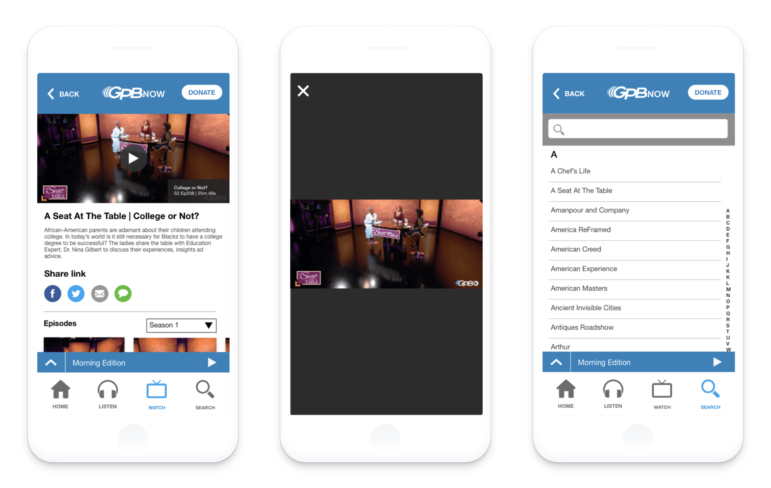
Wireframes and Competitive Analysis
The GPB NOW mobile concept draws inspiration from top-performing streaming apps—both within public media and beyond—to deliver a seamless experience for watching and listening on demand. To stay competitive and meet audience expectations, the wireframes incorporate proven patterns and features, including:
Carousel navigation for browsing featured and recommended content
Robust search for quick, intuitive content discovery
Listen Live functionality to stay connected with GPB Radio’s local and NPR broadcasts in real time
Donation and member benefit tools to support public media while offering users personalized perks
This approach ensures that the GPB NOW app feels familiar yet distinctly tailored to the needs of Georgia’s public media audience.


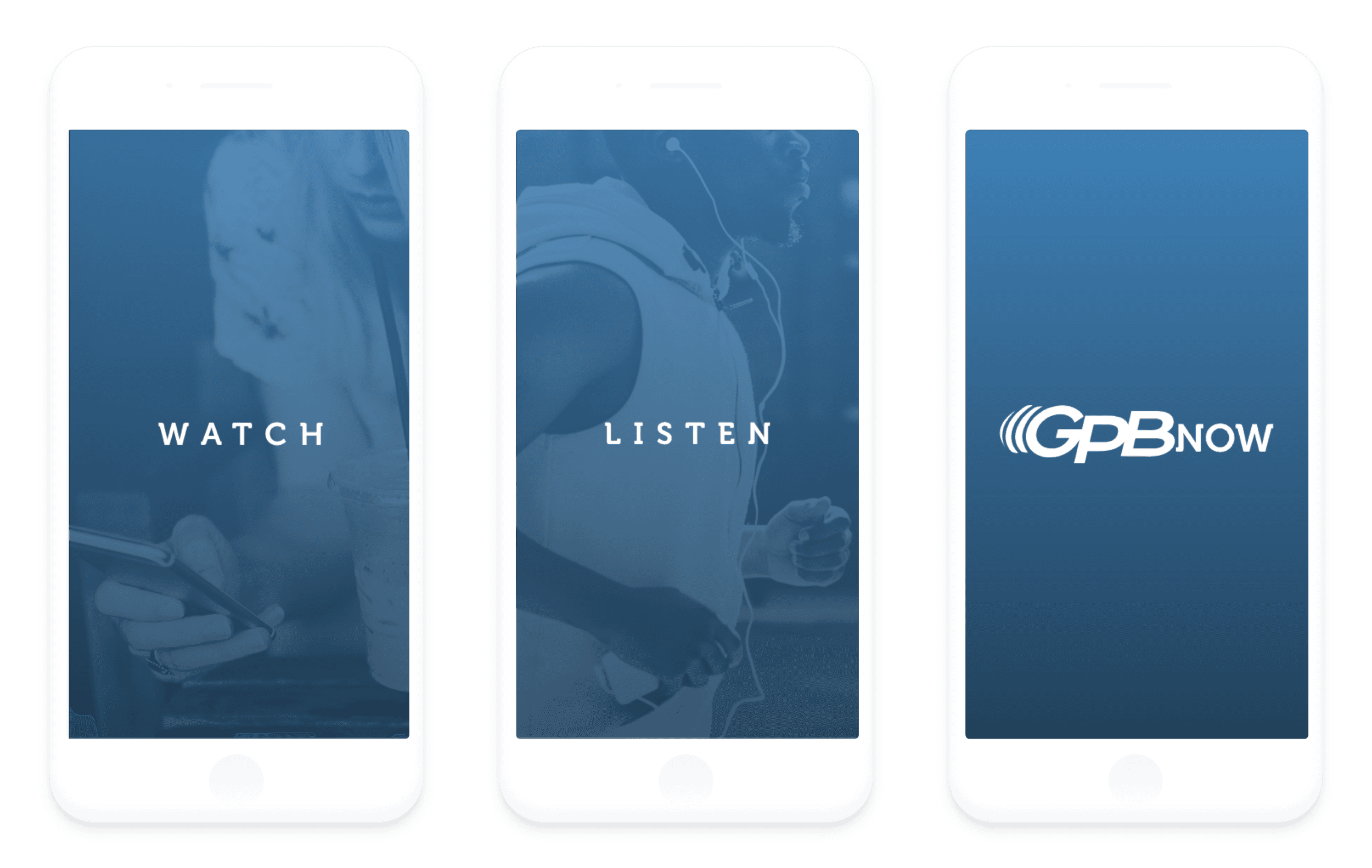
Visual Design
The final visual design brings Georgia Public Broadcasting’s brand to life in a clean, modern interface that makes navigating audio and video content seamless. Inspired by GPB’s trusted presence and broad audience, the design balances boldness with clarity—ensuring every screen feels familiar, inviting, and easy to use.
Typography, color, and iconography were carefully chosen to reflect the brand’s credibility while guiding users effortlessly through the app. Whether tuning in live or browsing on-demand content, the interface creates a cohesive, accessible experience that reinforces GPB’s identity and deepens user connection.


Copyright © 2025 Dravon